Spotify
MOBILE UI/UX CASE STUDY
2024
UI/UX redesign of Spotify's Jam feature, the company's premium social listening experience where users can curate a playlist live together.


THE CHALLENGE
The goal in this five-day design sprint was to synthesize third-party and hands-on user research to develop a new user interface and improved user experience for new, lapsed, and prospective Spotify Premium subscribers.
The solution concept evolved from a traditional carousel approach to a messy, infinitely refilling stack of “records” that users could casually browse if they did not want to use the reorganized, easier-
to-access features, such as Search or Explore.
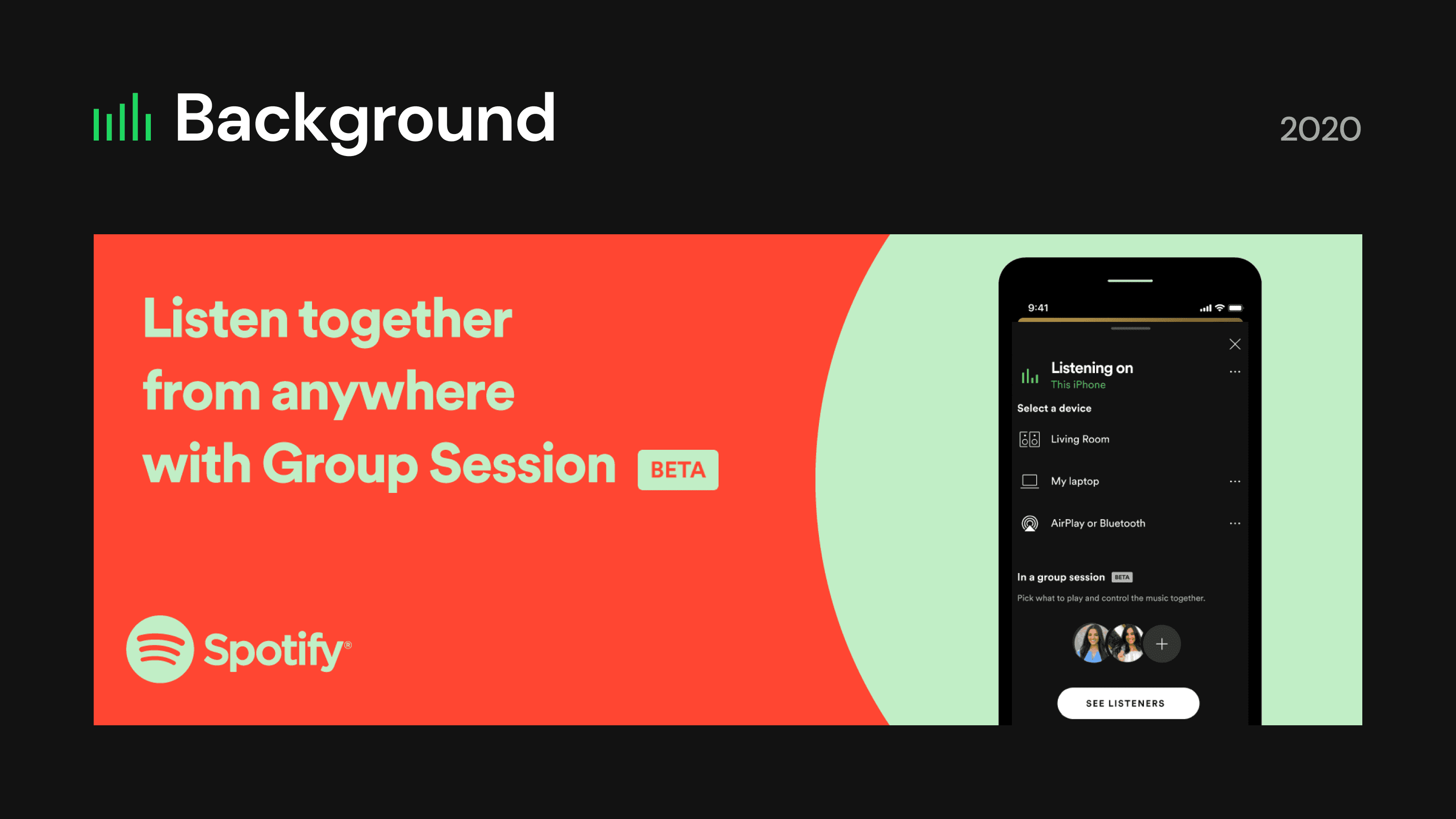
Identifying patterns in community feedback Spotify Jam revealed that some users could not find the access point to start a Jam, were unaware that Group Sessions was rebranded as Jam, and did not find the feature to match the value of Premium.
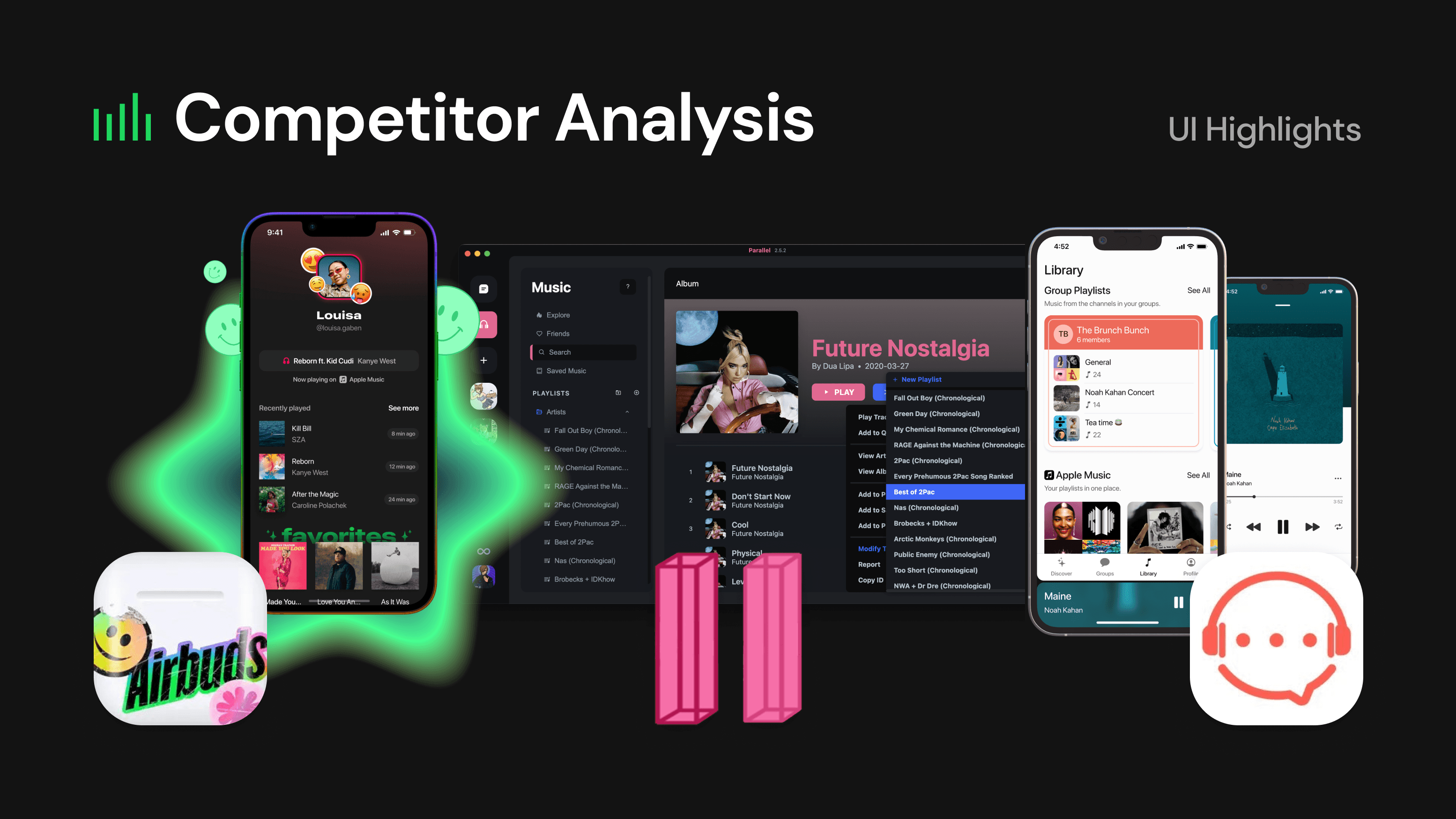
Through a competitor analysis survey, it was evident that certain competitors or complements to Spotify Jam presented visually rich solutions that enhanced the user experience through user interface.
Tools used:


THE APPROACH
The main potential for improvement exists in the full-width “div-like” elements of the main Jam screen. Excluding the mini player, this tall stack on the Spotify Jam home screen occupies 40-50% of the visible screen, presenting an opportunity for reorganization and reimagination.
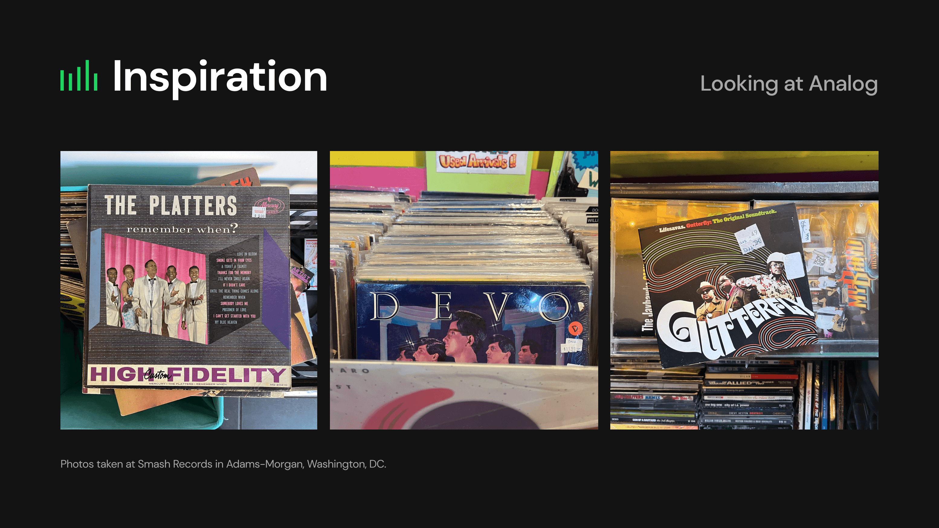
Reimaging Spotify Jam’s core home screen experience presented an opportunity to channel communal, analog joy in this digital context: sifting through a stack or bin of records, passing a CD from the backseat on a road trip, and queuing up a song with some coins in a juke box.
The result of the design sprint was the complete restructure, redesign, and reimagination of the Spotify Jam Home and Settings screens — including recreating a functional, miniature design system to replicate Spotify's proprietary one — to establish a foundation for additional iteration and improvements, including possible future features implied, such as Saving Jam Sessions.
Full presentation available below.
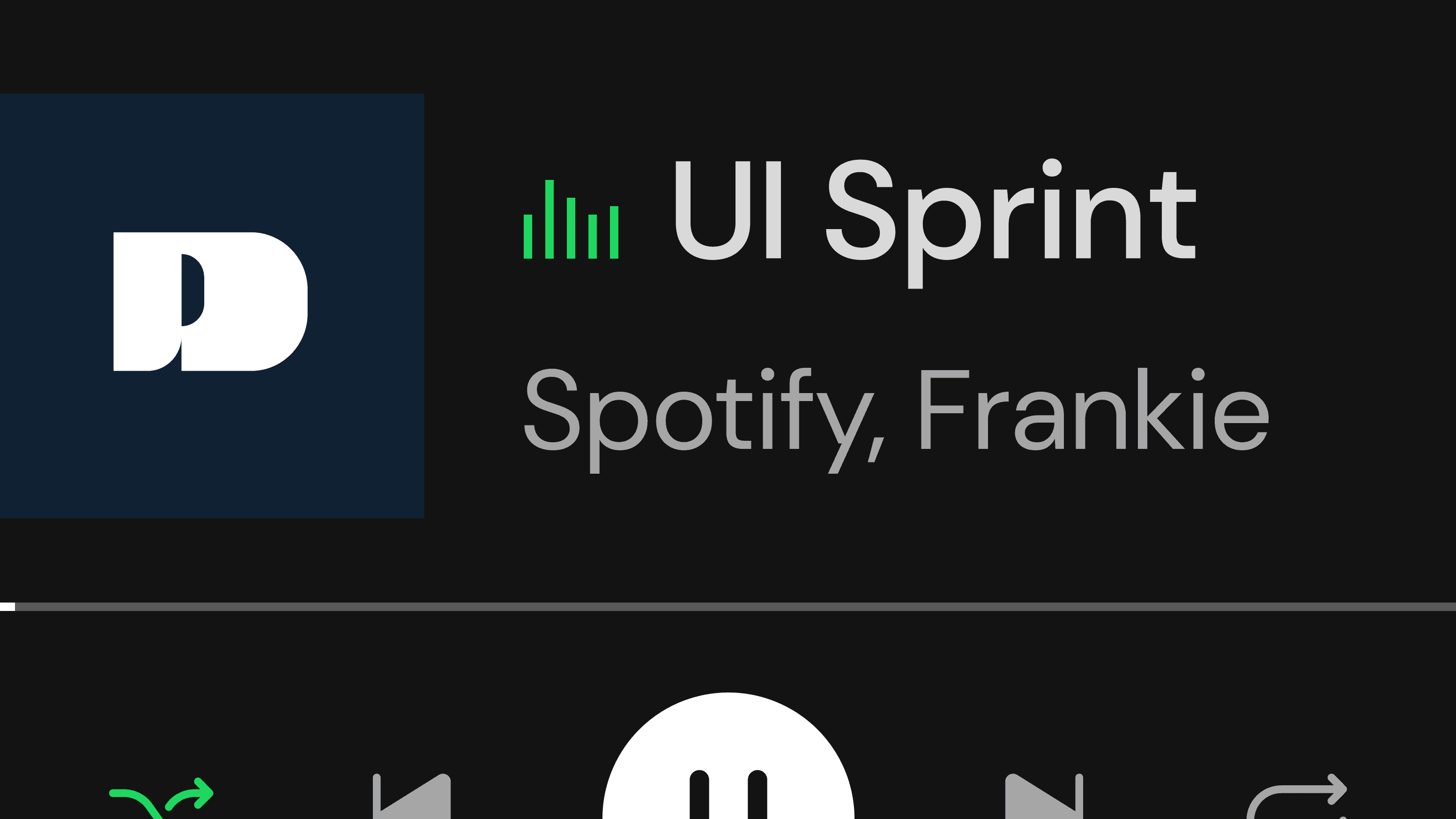


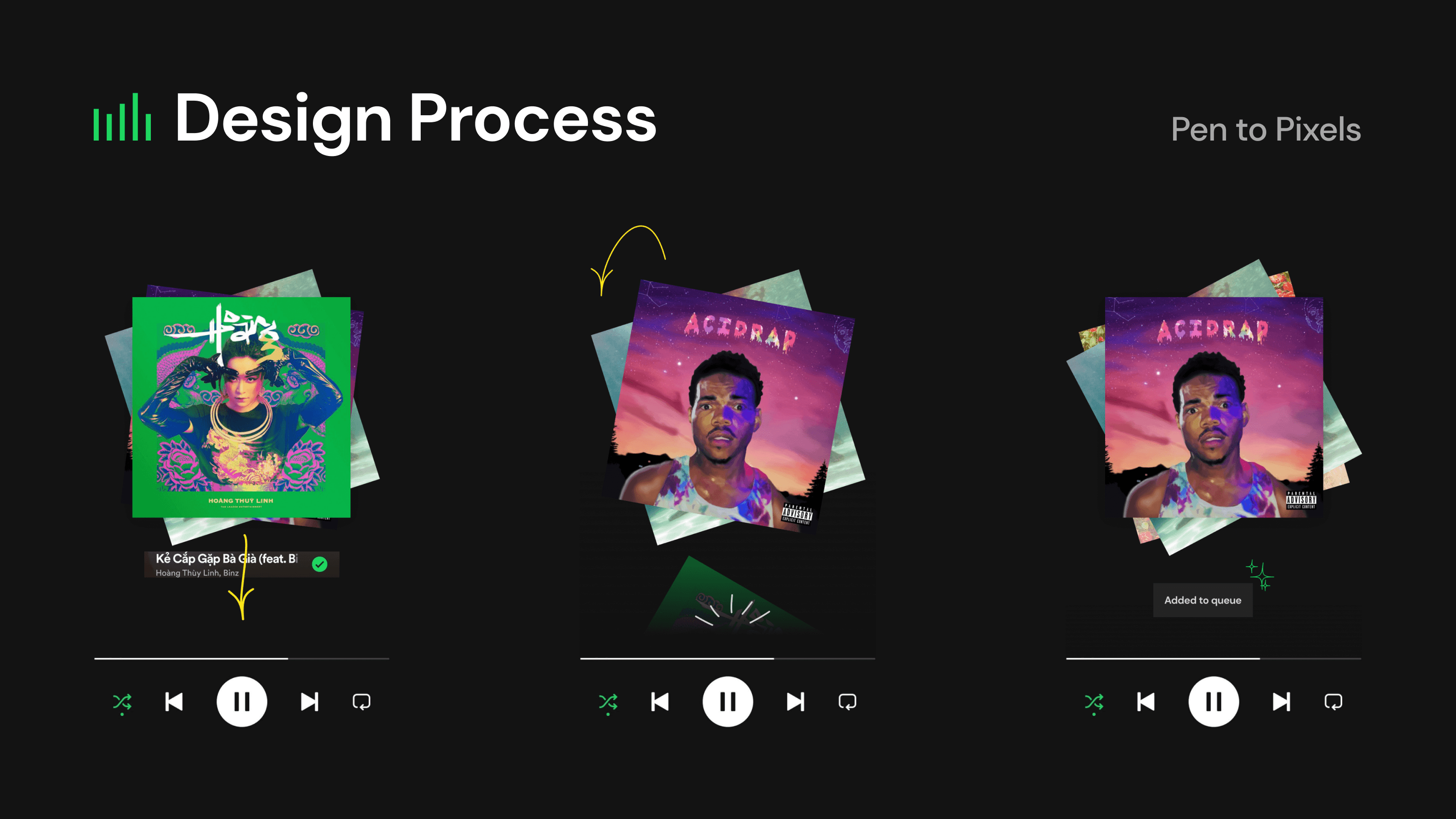
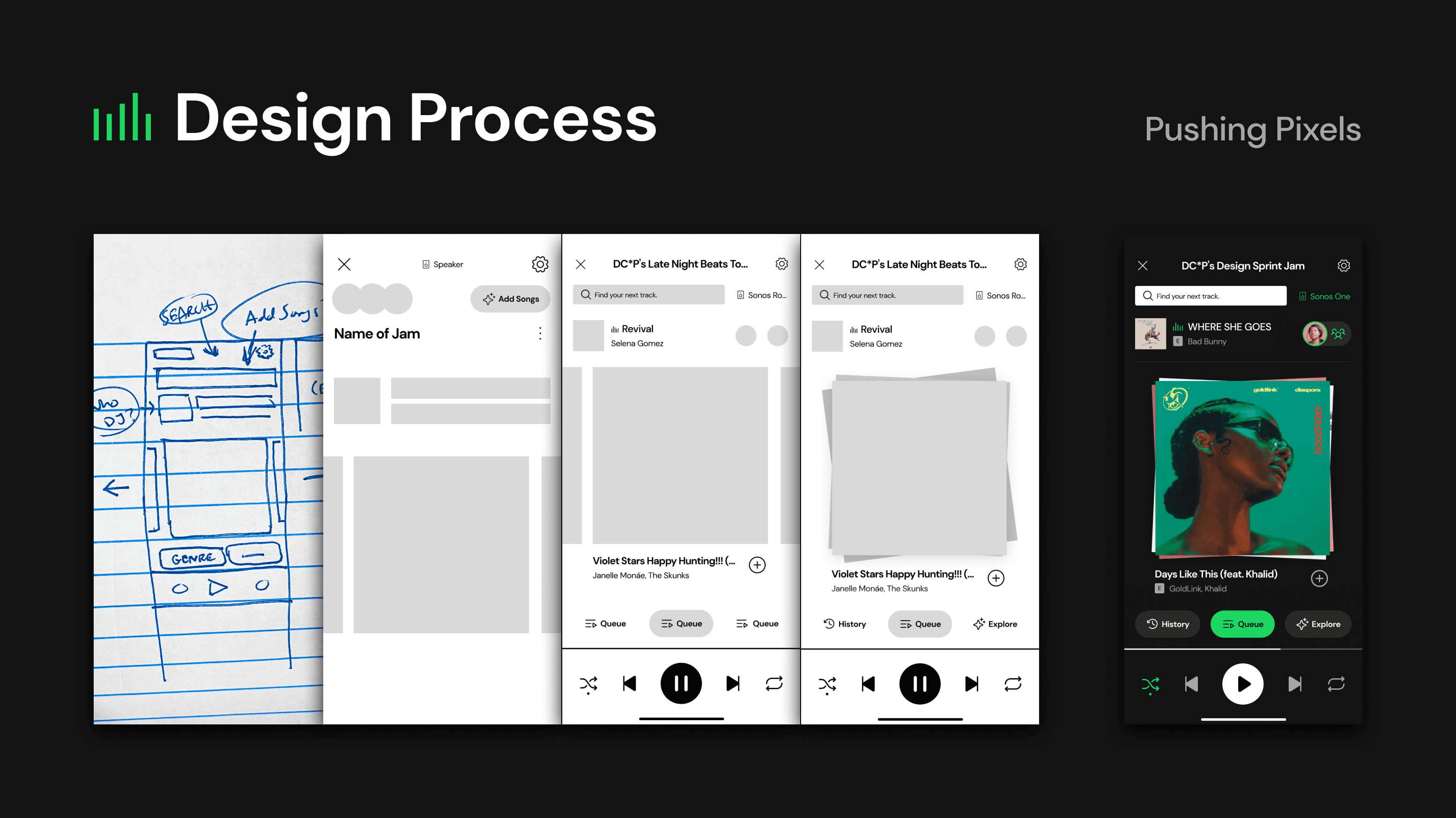


Existing Spotify screen recreated with open-source icons and a typeface similar to Spotify's proprietary design system.
Existing Spotify screen recreated with open-source icons and a typeface similar to Spotify's proprietary design system.
BUILT IN
WITH
Spotify
MOBILE UI/UX CASE STUDY
2024
Redesign of video game Dead by Daylight's user interface for its Map/Realm Offerings published for player use on community tool NightLight.
THE CHALLENGE
The goal in this five-day design sprint was to synthesize third-party and hands-on user research to develop a new user interface and improved user experience for new, lapsed, and prospective Spotify Premium subscribers.
The solution concept evolved from a traditional carousel approach to a messy, infinitely refilling stack of “records” that users could casually browse if they did not want to use the reorganized, easier-
to-access features, such as Search or Explore.
Identifying patterns in community feedback Spotify Jam revealed that some users could not find the access point to start a Jam, were unaware that Group Sessions was rebranded as Jam, and did not find the feature to match the value of Premium.
Through a competitor analysis survey, it was evident that certain competitors or complements to Spotify Jam presented visually rich solutions that enhanced the user experience through user interface.
Tools used:
THE APPROACH
The main potential for improvement exists in the full-width “div-like” elements of the main Jam screen. Excluding the mini player, this tall stack on the Spotify Jam home screen occupies 40-50% of the visible screen, presenting an opportunity for reorganization and reimagination.
Reimaging Spotify Jam’s core home screen experience presented an opportunity to channel communal, analog joy in this digital context: sifting through a stack or bin of records, passing a CD from the backseat on a road trip, and queuing up a song with some coins in a juke box.
The result of the design sprint was the complete restructure, redesign, and reimagination of the Spotify Jam Home and Settings screens — including recreating a functional, miniature design system to replicate Spotify's proprietary one — to establish a foundation for additional iteration and improvements, including possible future features implied, such as Saving Jam Sessions.
Full presentation available below.
Existing Spotify screen recreated with open-source icons and a typeface similar to Spotify's proprietary design system.